Cracker Barrel’s recent logo fiasco wasn’t an attempt to ‘go woke’ after all.
In mid-August, the Southern comfort food chain retired its iconic logo of a cross-legged old man on a rocking chair and replaced it with a flat, yellow version featuring only the company name.
The move backfired spectacularly.
Within days, customers accused the brand of abandoning its roots, employees revolted, the 93-year-old founder publicly slammed the CEO, and even Donald Trump weighed in. The company’s stock plunged $100million in a week.
Sales fell by $30million over a three-month period— the equivalent of 2.3 million plates of country-fried steak.
The backlash forced a swift U-turn in just two weeks. Cracker Barrel scrapped the new logo and dropped plans to modernize its rustic dining halls.
Now CEO Julie Felss Masino says the real reason for the change wasn’t political — it was practical.
Speaking at an investor summit in New York, she explained that the simplified design was meant to make the brand’s 660 restaurants more visible to drivers speeding down the interstate.
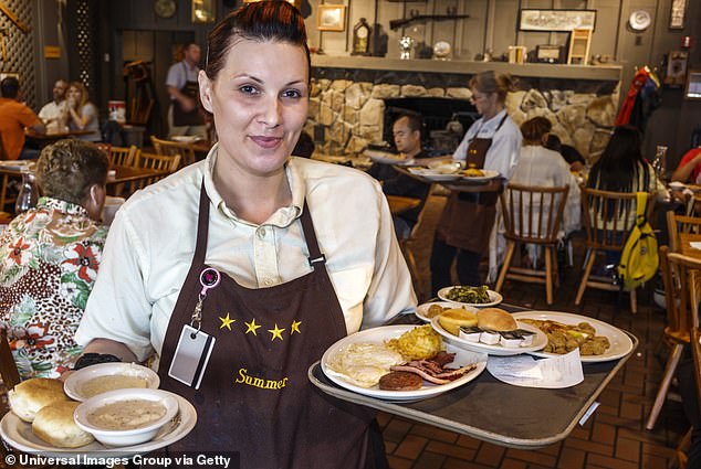
Cracker Barrel’s sales dropped precipitously after the company’s massive logo change
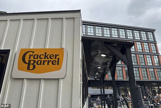
The company plotted $700million to modernize its brand, including a simpler logo that used a solid background and nixed the iconic old man – the CEO said the rebrand was supposed to make the restaurant easier to see from the highway
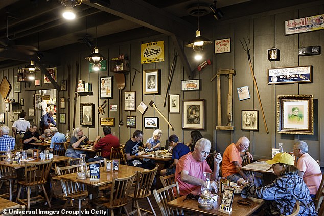
Cracker Barrel made the move after years of slumping sales – the company wanted to draw in younger customers after attracting a huge amount of elderly diners
The explanation makes some sense: the former sign had muted white and brown colors, reaffirming the company’s old-timey vibes.
For years, Cracker Barrel was running into an age problem: 26 percent of their customers were over the age of 65, while only 12 percent of visitors were between 25 and 34 years old.
Restaurant chains need to attract younger families to show they will maintain relevance for future generations.
And, while Cracker Barrel attracted older customers, it wasn’t crushing sales goals.
In 2024, the chain closed underperforming restaurants while executives found that their stores were in increasingly low-income areas.
Masino, a former Taco Bell and Starbucks boss, launched a makeover campaign with an estimated $600million to $700million price tag that included brighter colors, a new logo, and updated menus to attract younger diners.
But critics said the changes stripped away the brand’s character and charm.
‘It’s obvious that Cracker Barrel did not do its homework before launching its ‘rebrand,” Jerry Thomas, the CEO of Decision Analyst, a restaurant advising firm, previously told the Daily Mail.
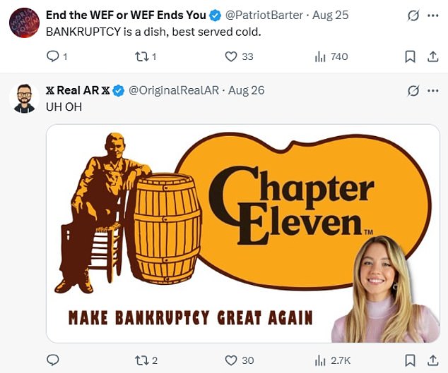
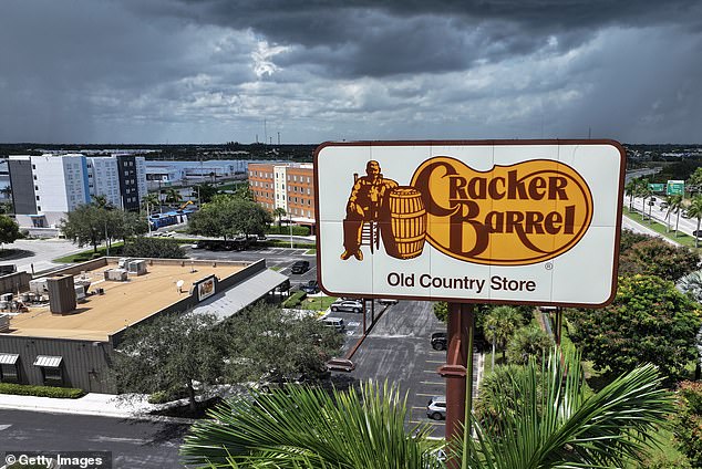
The company revived the old barrel after social media backlash reached the White House
‘It’s a major failure of Cracker Barrel’s senior management.’
Masino doesn’t agree with that criticism. She has repeatedly stated that the company underwent years of extensive customer research before settling on the updated photo.
But polls suggest the rollout wasn’t well received by the American public: a recent YouGov poll found that 65 percent of Americans were aware that the brand went through a logo change.
Only 29 percent of respondents said the changes made them less likely to dine there.
Cracker Barrel didn’t immediately respond to the Daily Mail’s request for comment.
